Hi! What are you looking for?

Welcome to my 3D junk fair! This is the place where you'll find all the stuff that I've modeled in 3D for the design of my house and garden - and I'm willing to share! Hooray!

Samstag, 5. Oktober 2013

Hi!

I know, it's been quite a long time since my last post. The reason is, that I was busy with the "real thing". I mean, what I've shown you on the pictures in this blog has finally become real and we recently moved to our new house! Hooray!

When we moved in, it wasn't 100% ready, but there were still a couple of things to do. Mostly furniture, final plumbing and electrics. There are yet many more little todo's, but after a busy day, I thought that it might be kind of relaxing to sit down at the computer and take some minutes to post a sign of life.

By the way, since I didn't get any comments or other feedback on this so far, I'd really appreciate it, if you could also take some time to write me some words on how you think about all this. Whether you like it, or not, if you find my explanations useful, or the files, or whatever. The comment-function should be right there for you to use!

To add some more value to this post, I've something to show you: Today, I installed the second toilet, here in our house. This is interesting, because it's a room (well, two room, actually), which I planned at a very high detail level before. So, I can make a comparison between the "what-if"-rendered image and a real photo:


Kewl, eh? And it only took a few free tools and a good portion of patience ;-)

Donnerstag, 11. Juli 2013

Shelf 2x4


Today, my girlfrient sent me to the Swedish furniture supermarket to get some of these shelves for our house, because they're a special offer for a few days. But, of course, to be able to try how exactly they'll fit into our new home, I had to make 3D-models to use in SweetHome3D. So I started FreeCad and got designing. Above, you can see the result: a 2x4 rack bookshelf in white and with a birch wood texture, which are the two designs we'll be using. Look for EXPEDIT, if you want the real stuff.

You can probably already imagine, that it wasn't a big deal to make these, since they are box shapes all over.  First, I needed to find out, how thick the side walls are and how thick the inner shelves are. The overall dimensions are available from the Swed's website. With some educated guessing, I soon got the correct thicknesses and was ready to go. In FreeCad's part view, I created a box with the original dimensions, 149x79x39cm, by the way. Then, I created another box, which is exactly as big as one of the eight racks: 33x33x39cm. I set the position according to the thicknesses of the outer and inner walls. The same was applied to copies of the box until I had 8 of them, all at the right places (where the racks have to be, that is). Afterwards, to make my like a bit easier, I selected all 8 boxes and merged them to a single object. Note, that this works, even though the boxes to not intersect! As a last step, I cut the 8-box-shape from the big outer shape and it was done.

This time, there was no material copying. For the birch one, I needed a texture, which I found on google. Try searching google images for the material you'd like to have along with the word "texture" and you'll most likely find something suitable within the first couple of hits. I imported the .obj file, which I exported from FreeCad to SweetHome3D. Then, for the first time, I used the material "editor" built into the latest version of SweetHome3D. It can be found on the properties page of any object:


The good thing about this editor is, that one can set the brilliance of the material with a slider, instead of just choosing between glossy or matte. So, I chose the birch wood texture, set the brilliance to a reasonable value by experiment and the exported the whole thing as .obj again from SweetHome3D to create a clean .mtl. The same procedure was for the white one, but of course there's no texture, but simply the color set to white.

Feel free to download the files for use with SweetHome3D, or any other program that supports .obj, here.

Glass Cube


Now here is something that looks pretty boring at first sight, but comes in quite handy for different uses. It's a cube made of glass. I must confess that I - again - copied the material from a .mtl file that came along with another object that contained glass. To be honest, I'm a bit unsatisfied with the material, because it is almost invisible on rendered images. That may be because it needs a little less transparency, or because the refraction might need enhancement - I don't know. Probably it would be a good idea to open it in Blender and experiment a little with the material properties. Unfortunately, I don't yet feel too confident with Blender, so I haven't tried enhancing the glass.

Saying that the material was copied from some other object's .mtl may already have given you a clue how to make such a cube of glass. It's pretty much the same procedure as for all the other objects I've showed you so far. Using SweetHome3D, I created a box. Then, I exported the box to a .obj file. After that, I used a text editor to copy the material definition and altered the .obj file to use the glass material for the box. That's it!

But: still wondering, what you could do with this? Well, the good thing is, that due to the box shape, it can be resized to glass sheets in whatever size one would need. I've used it, for example, as a filling for a guard rail (which I'm planning to show you in a later post). It could be used everywhere, where glass sheet is needed: frameless windows, coffee tables, parapet guards, aquariums, etc. I've also used a thin glass sheet on top of a box to generate interesting reflection effects from objects put on top. That's what I use as a presentation platform for images I'm rendering for this blog ;-)

If you ever need glass, you can download it here.

Mittwoch, 12. Juni 2013

Water Tap

water tap
Ok, next one: a water tap. It's the one which you may already have recognized on the pictures I've posted before. It measures about 14x14x5cm and is modeled after the "HANSAFORM" by HANSA (even though not 100% accurate).

To model this one in FreeCad, I started with a design drawing, which I found on the internet. I found out, that for such fixtures, it's worth doing a google image search. It's likely that you'll find a dimensioned drawing which is perfect to use as a template. It might be worth giving it a try to use such a drawing, vectorize it using e.g. InkScape (a free vector graphics program, I'd recommend) and then import it to FreeCad to work with that. FreeCad's "Import"-feature offers to import "SVG as geometry". I'll probably try this some time. In case of this water tap, there are even DXF files available for download from the HANSA online product catalog, which - of course - could also be used for 3D-modeling. Anyway, I chose a different approach.

Luckily, my girlfriend and I share a taste for simple design, so we chose a tap which's design is a combination of basic geometries: squares and circles. For the 3D-model, this means that it could easily be constructed by combining cylinders and boxes. I took the sizes and positions for these from the drawing and quickly had the basic design. One detail which is hard to see on the picture above is, that the lever rests on a sphere, so that it can be tilted and turned on the base part. This means, the model can be seen as two parts: the base, consisting of two cylinders, a box and a sphere and the lever, which is one cylinder and a box. In order to allow tilt, the back end of the lever is beveled, which I modeled by cutting a box (placed with an angle) off the lever. The final work was to use FreeCad's fillet feature for the edges with different radiuses for soft and sharp edges.

For use in SweetHome3D, I did the same as with the towel rail. First, I exported from FreeCad to .obj, then imported to SweetHome3D and exported again. After that, I modified the material file to use the mirror material for a chrome look and finally again did an import and export via SweetHome3D to get a clean .obj and .mtl.

I spent some time to get the picture on top of this post, because, when I tried to simply put  the tap into a new SweetHome3D project and then make a photo, that didn't look good because it was to "flat" and boring. Also, the contrast between the tap and the background of the scene was poor, because the tap is a mirror but there is nothing which could reflect on it. The trick I ended up with, was to put the tap onto a glass plate, which causes some reflection that helps making the scene a bit more interesting. I you need a simple glass cube, which you can scale as you like, you can download it here.

The tap can be downloaded here.

Donnerstag, 6. Juni 2013

Basin

Basin 60x27x13

Basin 40x41x13


These are two variants of a wash hand basin. If you'd like to have something similar for your bathroom, go to IKEA and look for Lillangen. The first one measures 60x27x13cm, the other one 40x41x13cm.

Both are mainly made of boxes. The outer shape of the basin is a box with the dimensions as said before. Then, I made boxes with the size of the reservoir and tray (for the second basin) and cut them from the boxes created before. After that, extensively using the fillet feature in FreeCad, I gave the basins the soft ceramic-look. The sink overflow is a cylinder, also cut from the rest. The sink with it's beveled border is the only thing which is a bit more complex. You could for example first cut a flat cone (inverted, of course) from the basin's bottom to get the beveled border and then cut a cylinder to make a hole. I didn't have that idea, but instead made a part shaped like the hole including the bevel and then cut that one from the basin. To make that part, I used the Draft view in FreeCad and draw a half-profile of the part. Let me show you a screenshot:
Screenshot: half-profile of the sink
Then, I used the revolve function to make a part for the sink. The latest version of FreeCad has improved the revolve function, so that you can select an edge of the shape which you'd like to revolve as the revolve axis, which is very useful! After revolving, the part looks like this:
Screenshot: revolved sink part
The only thing which was left for me to finish the basins was then to use the revolved sink part and cut it from the basins bottom.

Last, I exported from FreeCad to an .obj file, imported that to SweetHome3D, set the color to white and glossy and exported again to .obj to get a clean file and a .mtl for it. The renderings on top of this post were also made using SweetHome3D (use the 3D-view settings to turn lights down a little when rendering only single objects, otherwise they'll get so bright that no contours are visible any more).

Here's what the basin looks in action:
Wash hands basin for a toilet along with other furniture (lighting is not perfect again - sorry...)
If you'd like to use these objects in your own project, for example in SweetHome3D, you can download them here.


Montag, 27. Mai 2013

Towel Rail

Ok, here we go. Let's start with something pretty simple: a towel rail for the bathroom

Towel rail

It's a chrome towel rail for two towels, 50cm long. It looks somewhat similar to a "Grohe Essentials".

Basically, this is simply a combination of cylinders. I thought about which parts the real thing might be made up and then built it that way in FreeCAD. Then, I used the fillet function on almost all edges with different radiuses. For this object, everything can be done in FreeCAD's "Part" view.
One small detail for a realistic appearance is, that the upper and lower bars are arranged with an angle. When arranging this using the "placement" in FreeCAD, it is important to set the rotation axis correctly aligned with the center of the holder part for the bar. I actually built the upper bar with it's holder first from two cylinders, merged and rounded. Then, I mirrored it for the lower bar. The wall mount is also made of two cylinders, plus an additional one for the cover (it's a separate part which slides against the wall to cover the screw heads, therefore it's not merged with the actual wall mount). When all the parts were ready, I rotated the bars and positioned everything so that it's correctly aligned.

To get the chrome appearance, I used a trick: after exporting the design from FreeCAD as a .obj file, I imported it to Sweet Home 3D, only to add it to a new "House" project and then export it from the 3D-view again to a .obj file. Sweet Home 3D then creates the .obj file, and a .mtl file containing the material definitions. Then I opened the .mtl file of another object, which had the surface I wanted, in a text editor (actually, the object was a mirror). Using the text editor, I copied the material definition from the mirror to the material file of my towel rail. Works perfectly!
Of course, there would have been other ways to create a suitable material. I've already experimented with Blender, but for me and for the task, it appeared too complicated.

Here's another picture of the towel rail "in action":
Towel rail in "my" bathroom

By the way: the images above are rendered using the picture function in Sweet Home 3D's 3D-view window.

If you'd like to use my towel rail for your project, you can download it here. I hope you like it, or maybe found some inspiration to make something similar yourself. Of course, my explanation of how I created it is not a step-by-step recipe, but with some help from the programs' websites or google, it shouldn't be too hard to try yourself.

Freitag, 24. Mai 2013

Hi!

I'm happy to welcome you to my 3D junk fair! This is my first post to this (any, in fact) blog, so let me explain in a few words, what this is all about:

Maybe you've been trying to plan the home of your dreams with one of these 3D-home-planners - I did! And while I did, I soon recognized, that the objects which came with the software or are available for download are nice, but not quite what I'll be actually using in my house. But I wanted to plan my house! So, I needed an alternative...

Well, you should know that the program of choice for my home planning is the fantastic Sweet Home 3D by eTeks (http://www.sweethome3d.com/). This software is very easy to use and packed with features, you wouldn't believe that it actually is free! It has much improved over the last couple of years (yes, I've spent quite some time planning my home...), so that I wouldn't only consider it a great tool for interior design, but with a little experience in using it also for gardens - or whatever one might imagine. There is some good furniture installed with the program and even more available for download via the product website. To get more, there is an import feature for e.g. wavefront .obj files into the furniture catalog - and this is where I saw  the chance to get my features in!

Let me give you some impressions of what I've achieved so far:
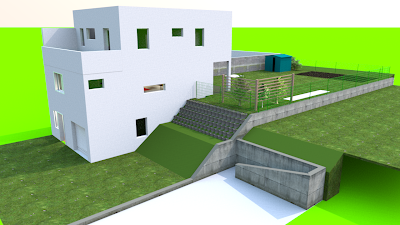
Not bad, eh?

Let's enter the house:


Yeah, I know, the lights are not perfect...

Here's my favourite: the bathroom


Much of what's shown on above pictures is done using the objects that come ready with Sweet Home 3D, or with simple boxes resized and colored. But there is also some self-made stuff, especially in the bathroom: bathtub, sink, fittings, ...

But how did I make them?

Well, this is where another free program comes into play: FreeCAD (http://sourceforge.net/apps/mediawiki/free-cad). I'm not a design engineer by profession, so learning this program, which is a 3D design program, was quite painful. In fact, it was not only learning the program, but also designing in 3D ;-) It doesn't seem as though this opensource project is being heavily worked on, but at least there was a new release, 0.13, recently. As the version number suggests, the program is not yet in release state, but kind of a beta. The previous version, which I started with, was a bit unstable, which was annoying from time to time. I was looking around for alternatives, but found none which I would have wanted to afford. There are for sure still a lot of features, e.g. python scripting, which I haven't tried yet. So, there is potential for even better designs than the ones i've achieved so far.

Maybe you're inspired now to have a look at these programs and give them a try yourself. It's fun!

Now, what I'd like to do here, is to share with you these objects that I've created for my planning. That will be furniture, fittings, stuff for the garden, ... I'm planning to show you one object per post with a brief explanation what it's used for, what real-world object it is inspired by, and also offer you to download the wavefront file, so you can use it in planning software yourself (I'll probably ask for some kind of donation, without obligation, to give you a chance to support my work if you like it).

Also, I'll probably feel like sharing with you some of my experiences as a "non-professional designer" - we'll see if there's anything I find worth sharing.

Last, please keep in mind that everything I show here is self-taught and therefore may be far from perfect. I'm pretty sure that there are a lot of mistakes in my models, which a professional designer wouldn't make. At least, it works for me and may be of use for you in some way or the other.

Preview? Ok: